Big news! After celebrating a quarter century of empowering single parents to break the cycle of poverty, Mom’s House is releasing an updated brand identity, which includes a new logo, colors, and font. You’ll see the new look anywhere we’re out in public, like our website, Facebook, Instagram, and LinkedIn. We believe the new look better matches what we’ve become since 1991: a center that empowers single parents to break the cycle of poverty through childcare, support and resources. Continuing our vision that every mother (and father) has the right to raise their family in dignity despite an individual’s background and socioeconomic status.
Since our founding in 1991, we’ve more or less stuck with the same “M” & “H” under one roof logo, although we had recently altered our colors. But in the last few years we’ve changed a lot: we have expanded our services to help more parents pursue a larger range of full time education; we have earned the second highest accreditation from the state for the quality of child care we provide; we launched a new program for our parent graduates and their preschoolers to continue their success long-term.
The old look seemed outdated. The house structure confused many into thinking we were a residential program, and the look did not represent the sense of empowerment, focus and strength our families have in this program. Whether you are a parent or a child from the Mom’s House program, you are unique alum and should be very proud. As well as if you are a donor supporting Mom’s House, you are bettering the lives for two generations and should be proud. Needless to say, it was time for a change.
Our design goal was to better match how we look to our values and families we serve. A small team inside Mom’s House with the assistance of the Higher Information Group worked to find something that appeared crisp, approachable, smart, friendly, and connected.
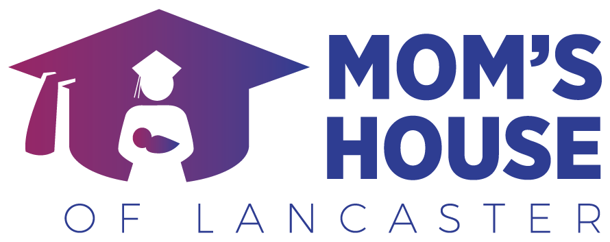
The parent and baby in the logo, quite obviously, represent our mission to support single parent families, but it’s stylized with curves to appear friendly, and gender neutral.
We hope you like this new look and feel for Mom’s House! Look out for more updates as we continue to try to better serve our families and the community through childcare, education and support to two generations.
![]()
